Why
Healthcare compliance and certification by The Joint Commission or DNV is a primary driver for CMMS applications. Our clients use a combination of reports and detailed work orders from our product with policy documents, and sometimes additional software packages to track their status on compliance. We have an opportunity to expand compliance offerings within TWH to become their primary application for facilities maintenance. This can be a competitive differentiator for this product in the healthcare market with an expected 35% increase in potential revenue
Goal
Build a visual-leaning dashboard that highlights compliance features hospitals need to focus on and authorities having jurisdiction need to see.
Discovery Interviews
I interviewed internal and 3 external clients. We also made some visits to some retirement clients (who have different standards) and some hospitals to get an actual feel for what is needed from clients.
Competitive Analysis
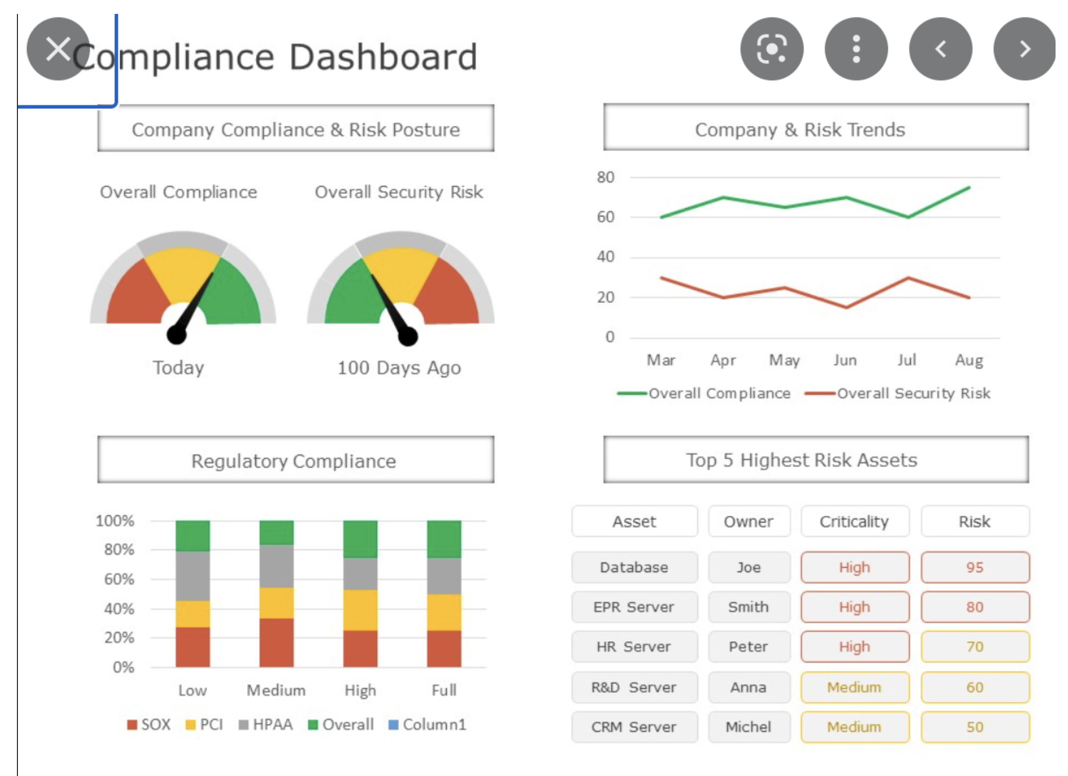
Since this hasn't really been done before it was hard to find competitors with updated sites that we could look at. We were able to get our hands on a form to look at what Join Commission surveys with so we could start getting an idea if we even wanted to have a dashboard page..or did we just want a list page? What we found through competitors is that people wanted to have both.
These are an example of the binders clients use to organize their compliance.
They usually organize by categories such as fire alarms, Drills, etc. and within those
A big one is for surveyers from the state: Don’t show more than what is needed

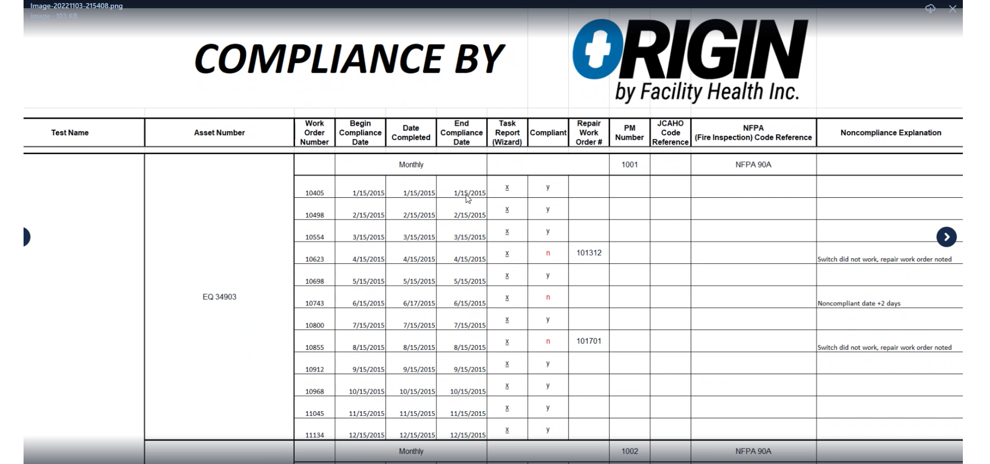
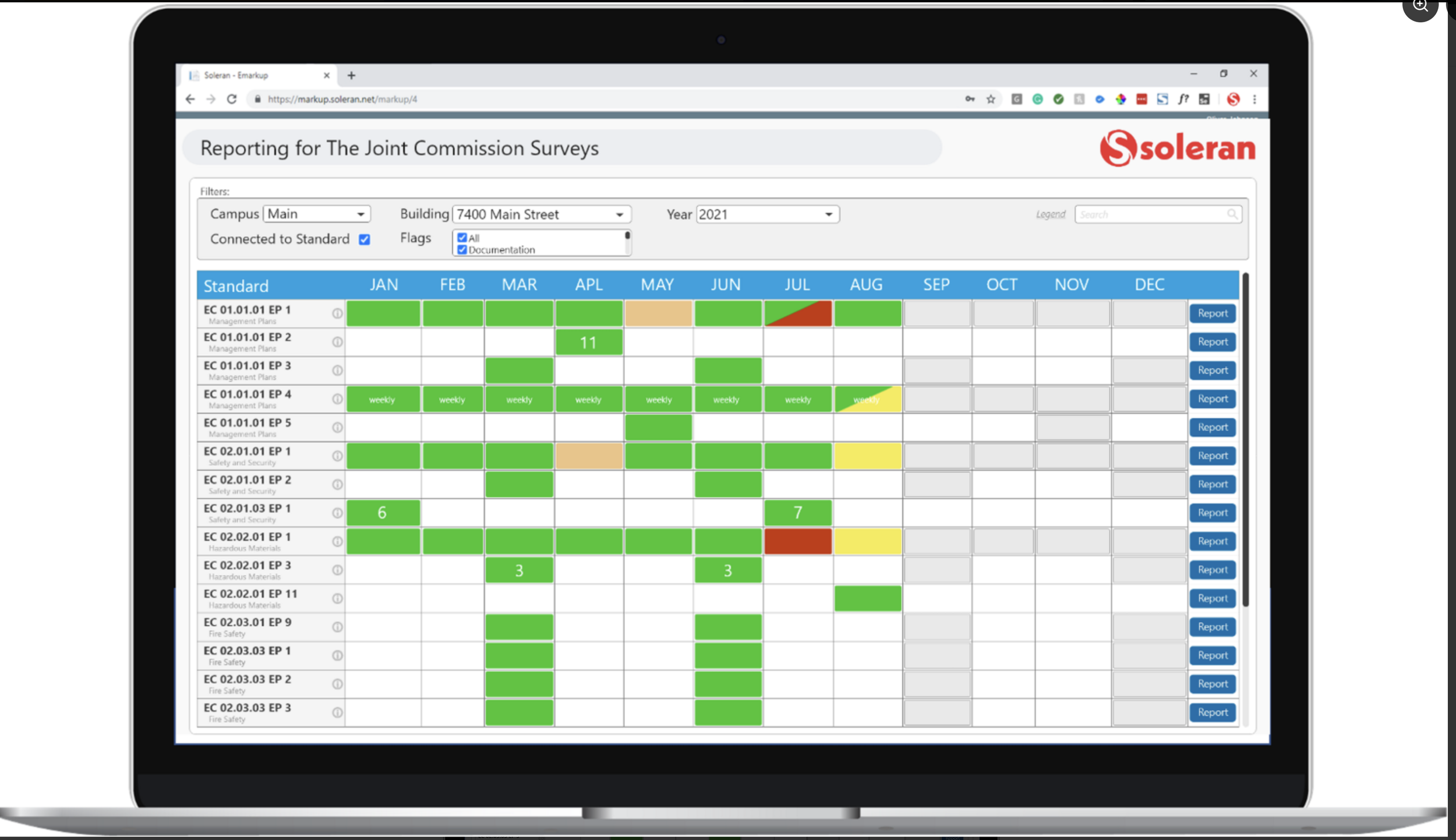
Here is one of the pages in the big binder.
This is an example of what goes into abiding by the compliance rules and how they have to document certain actions to make sure the device is compliant.
Client Interview Screens
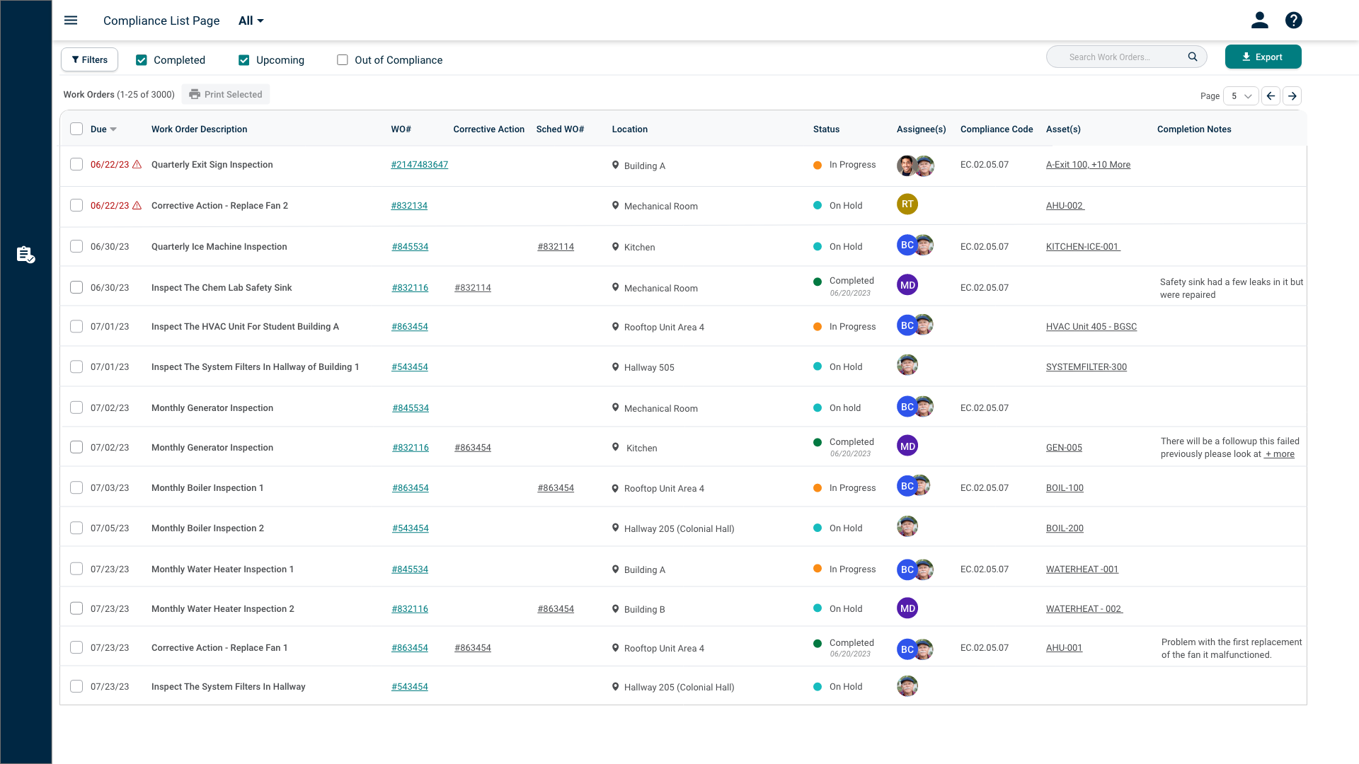
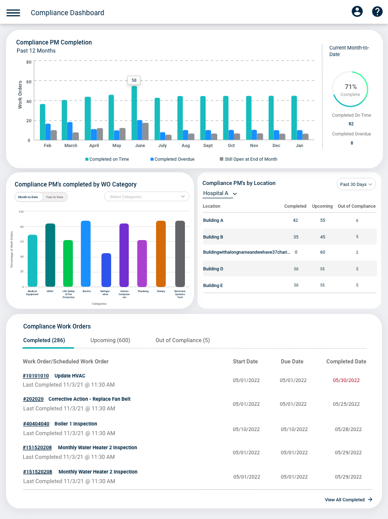
Once we had an idea of what our competitors used. We decided to put a couple KPI's and List Page together and test it internally and with other clients.
Each screen has different kind of KPI's. We then asked clients to rank them from most to least useful. We also showed them the list page and asked what columns would be most useful to them and what they thought. For the most part we got positive feedback, but for clients who are used to "pen and paper" and old school ways they were not as into the designs like we thought they would be..

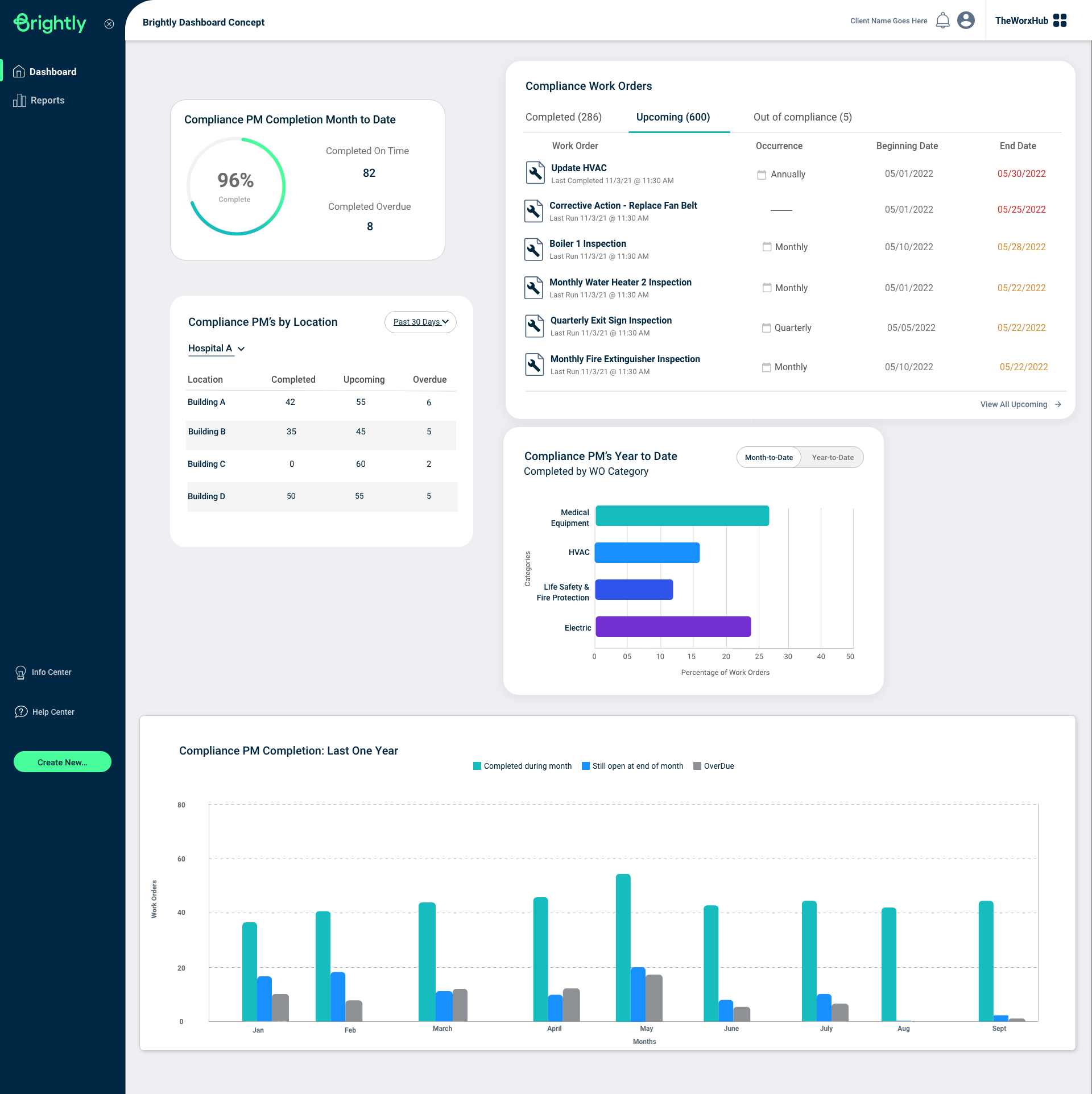
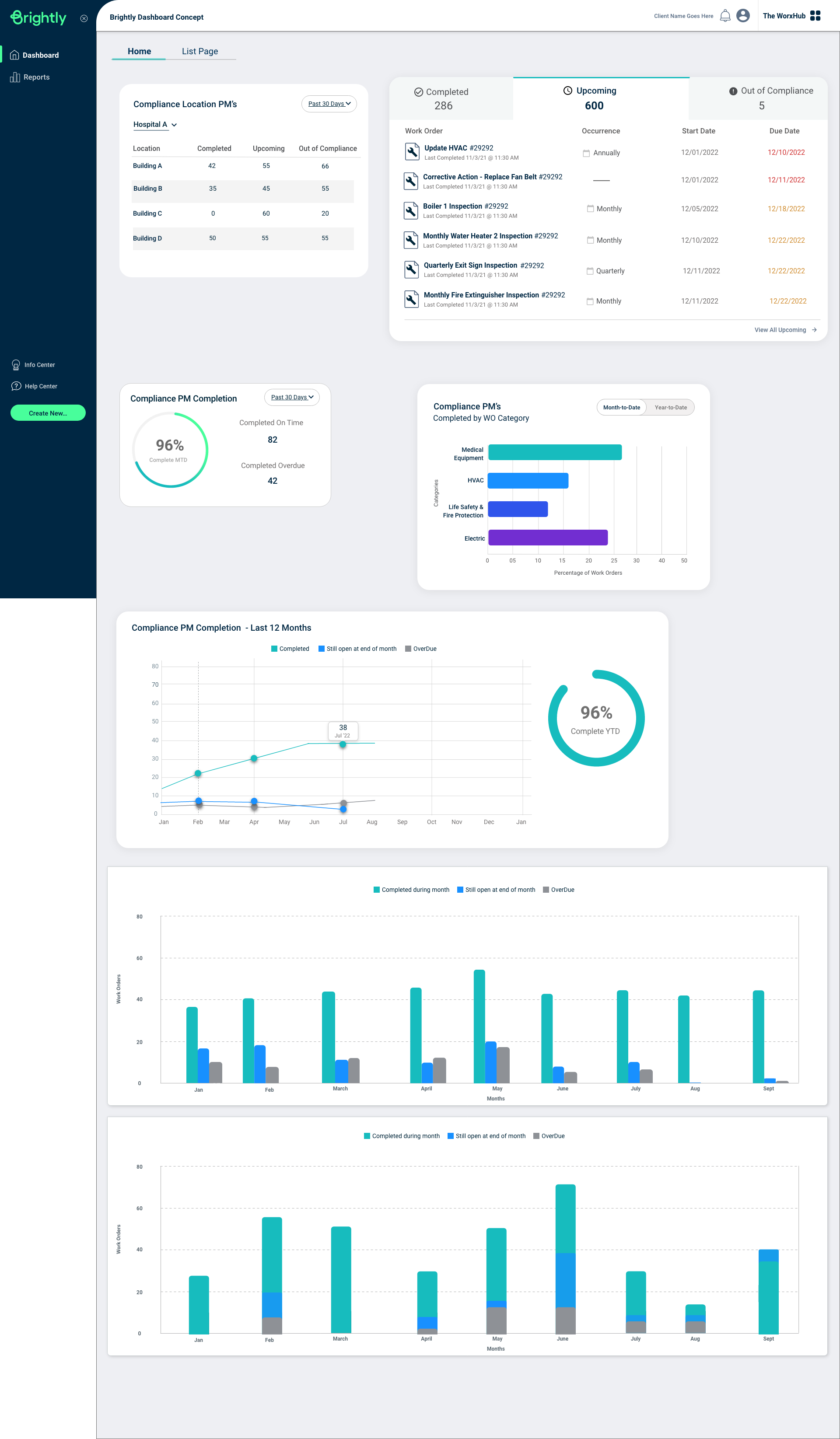
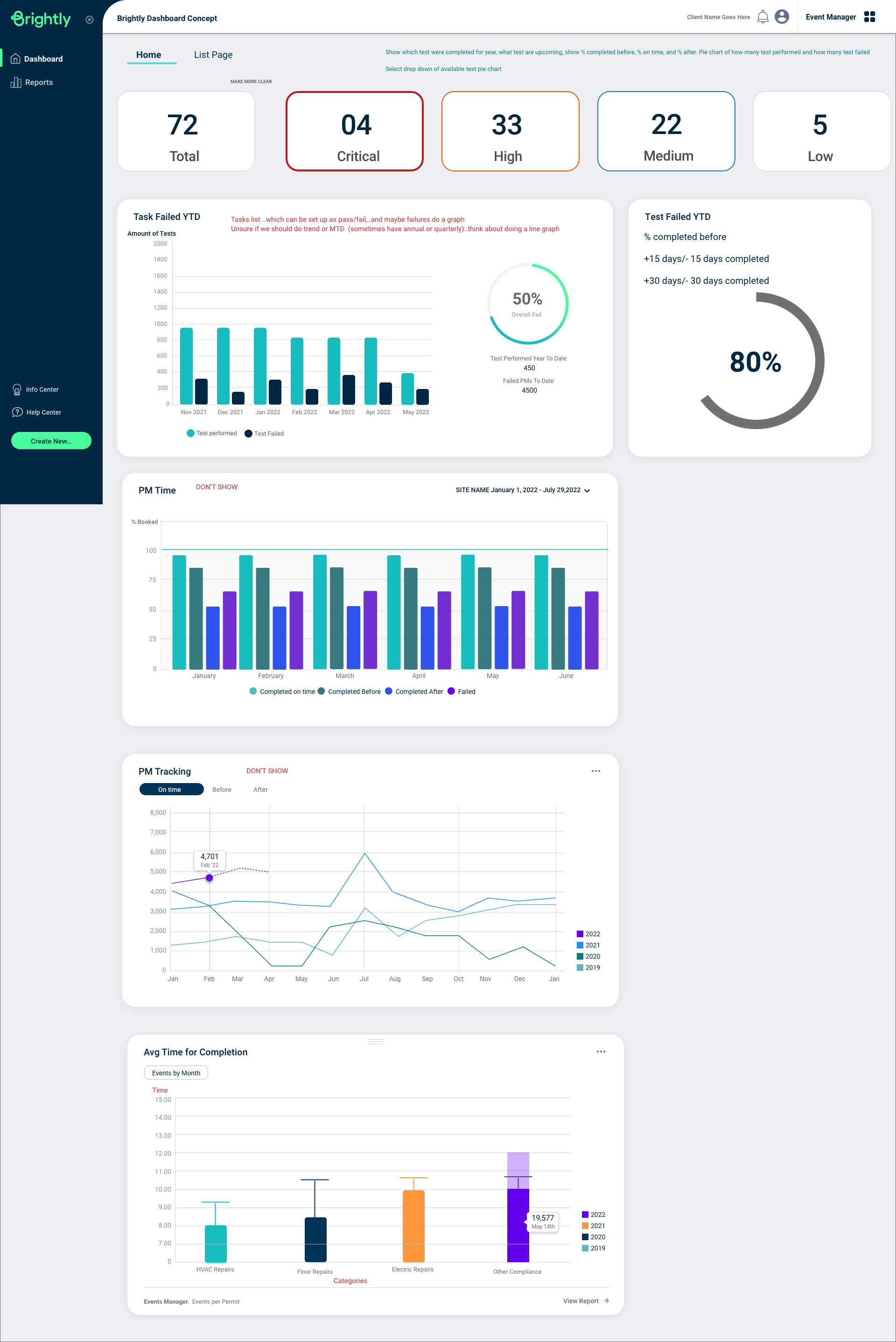
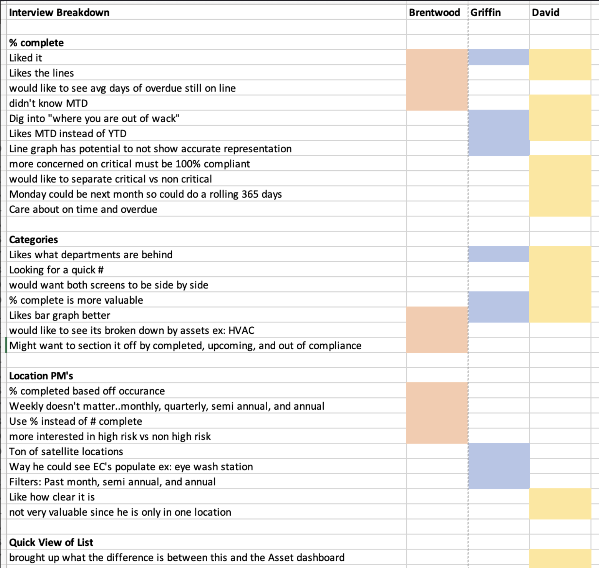
Interview Breakdown
Here I decided to use the rainbow spreadsheet to let us realize what things were good and bad.
What we learned: We got a good result on certain KPI's so we know what we needed to narrow it down to from most useful to least. We had problem knowing what KPI's would be most useful from our clients and based off results knew to keep the WO Completion..and to modify things like "Out of Compliance" being less noticeable because we learned an inspector doesn't want to see any "red" and cause anymore attention than needed.
Also another surprisingly learn..is people prefer bar graphs over pie charts :

Final Designs
Learning from what clients have said above^ We decided to narrow it down to 4 KPI's. Our most positive feedback KPI was the quick view of the compliance WO and Compliance PM completion. The WO category and Location got high interest, but the reason it wasn't as high as others is because certain businesses set up their accounts different than others. So for example, for Compliance PM Location..that one is set up based off child locations, however some businesses just have parent locations and wouldn't see this as useful. Same applies to WO Category, where depending on the business they might not have a lot of WO categories (maybe 2).
List page wise we knew what columns we wanted to show first based off the user interviews (such as status, corrective action, WO#) which also helped us this become responsive for web, mobile, and tablet.
