QuickLearn is an easy user friendly app with limited distractions that allows you to learn a new language in a timely manner wherever you are.
Competitive Analysis
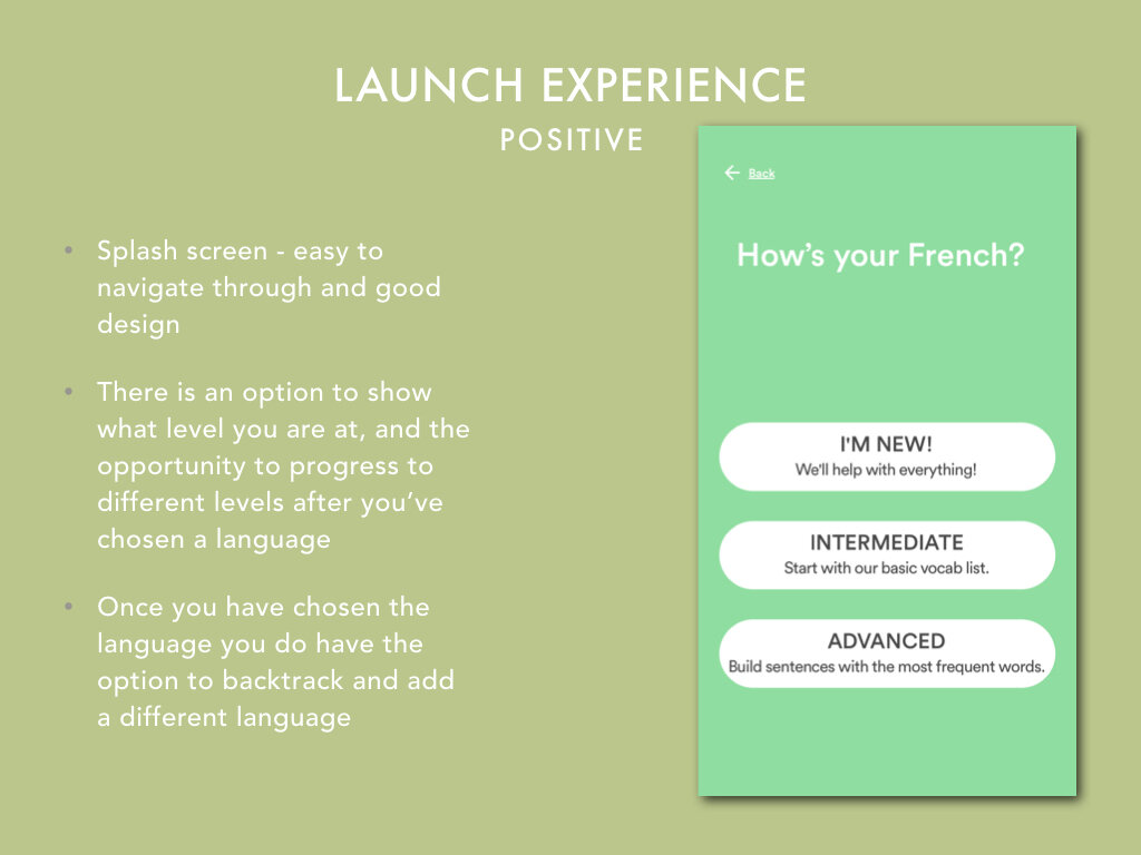
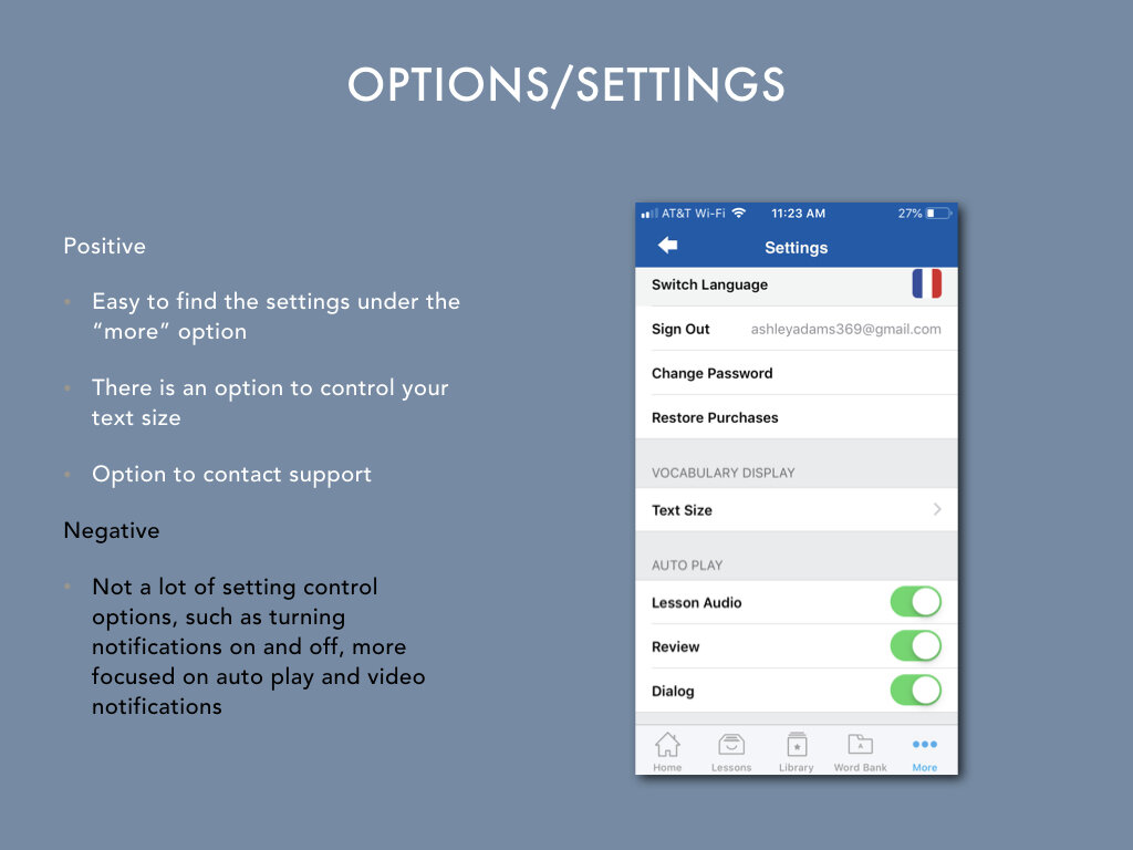
Here I compared and contrasted 3 apps to see what my competition looks like and what I can learn to improve from my competitors.
By doing this I will look at: launch experience, navigation, buttons, options/settings, and difficulty/ease of task completion.
User Interview
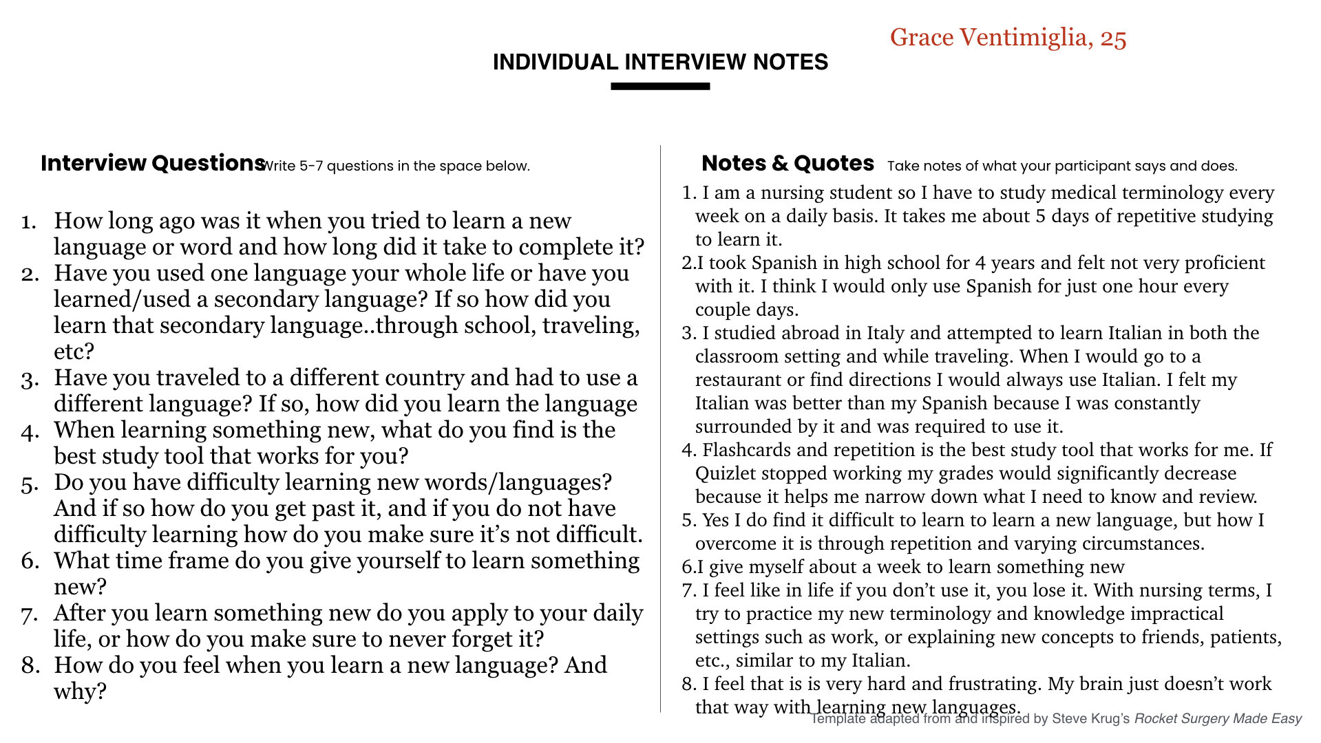
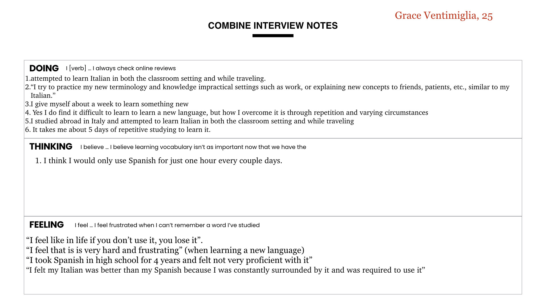
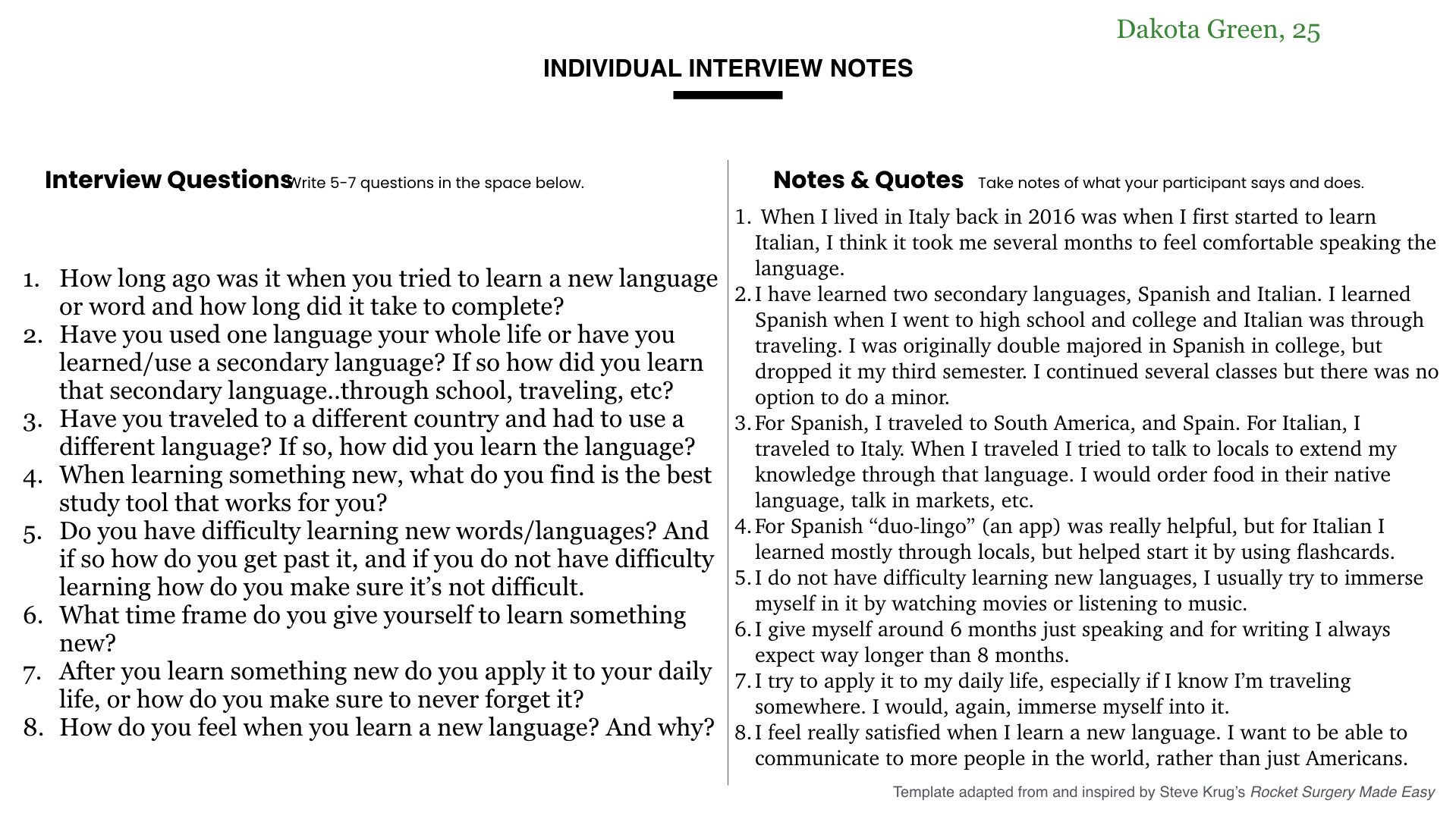
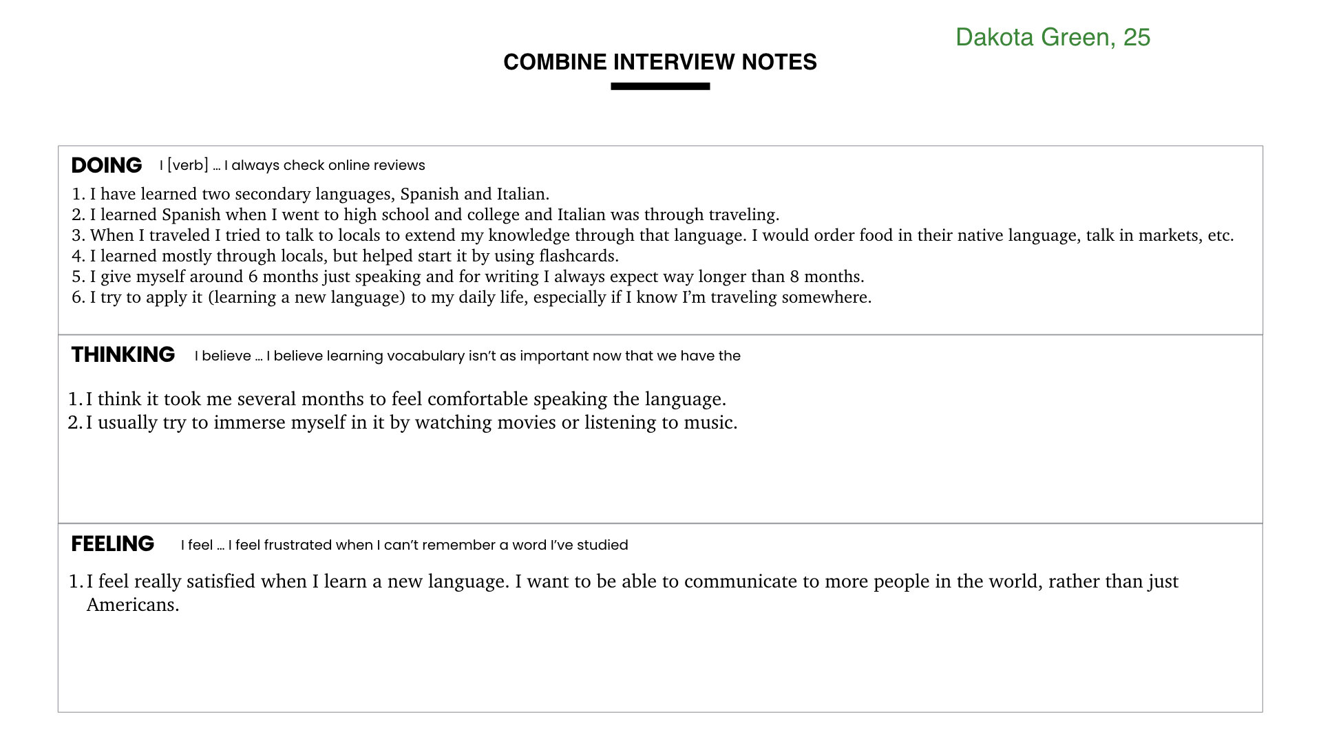
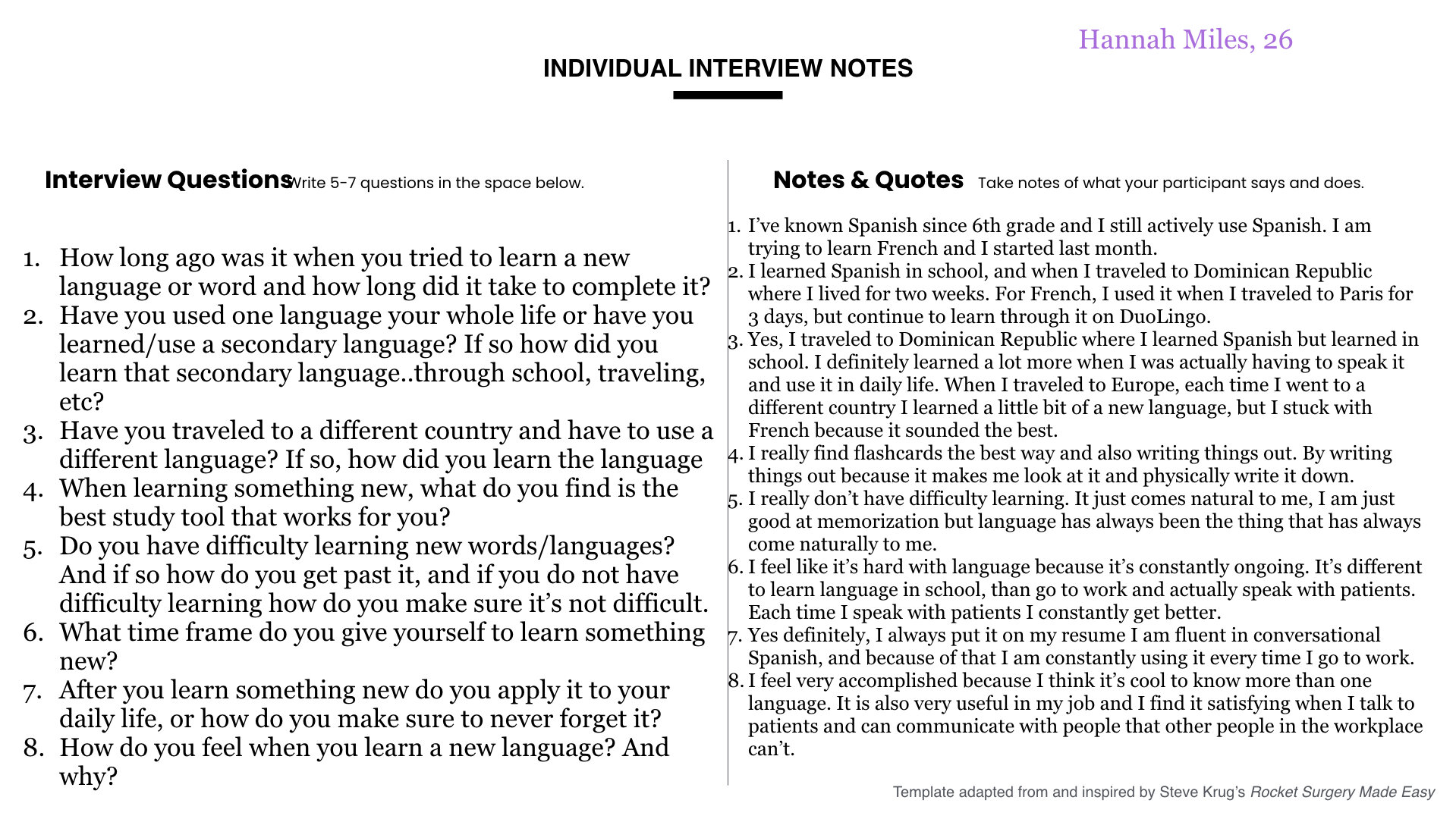
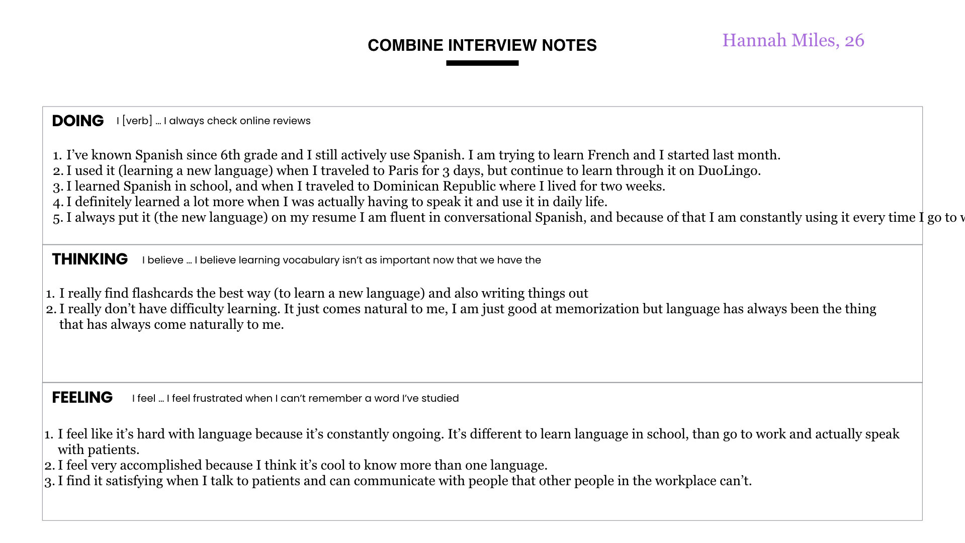
Here I interviewed 3 individuals regarding general questions on how they memorize language so I can learn more about the app and what is most important to include in the app.
User Persona
Here Brittany has her goals and motivations listed. However her problem is that she needs a quick and efficient way to learn the basics of Portuguese before she leaves for her study abroad trip. The challenges she faces are staying on track, learning a new language, not being able to practice with locals before leaving, and doesn’t have a lot of free time with being in school already.
Based off Courtneys problem, challenges, as well as goals and motivation will direct on how I will create QuickLearn.
Userflows
Setting up a login for a new user
Learn a new word
Sketches
Crazy 8 Technique
Before choosing my login page and how I wanted to create a new word sketch I first used a crazy 8 technique in which I chose to do 8 screens of how I wanted my screen to look like and took 5 minutes to draw each one. I would then put a dot to the screens I liked that would then be added to my final drawing.
Setting Up a Login for New User
Learning a New Word
Usability Test
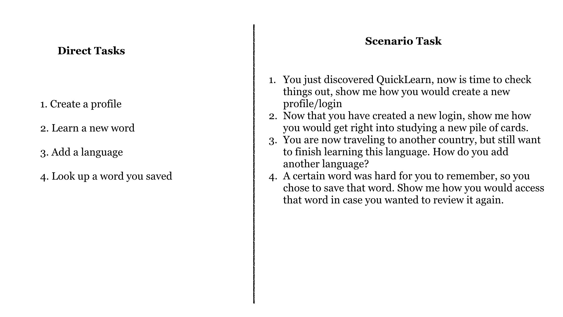
Here I interviewed 4 people and took diligent notes as they went through the app. I made sure to record the interviews so I could go back through and see reactions that I may have not noticed before. These test were done at participants houses so that they would be most comfortable.
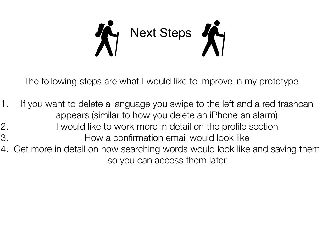
Based off the Usability Test Report I wrote down my observations and ranked the severity of the observation (0 (requiring no change) - 4 (must change)). There weren’t any observations that were too severe where I would have to make a major change on the app. The 2 rankings I got that weren’t 0 was 1, which is something for me to consider on what I would like to change with the app.
Updated Prototype
Heres an updated low fidelity prototype


