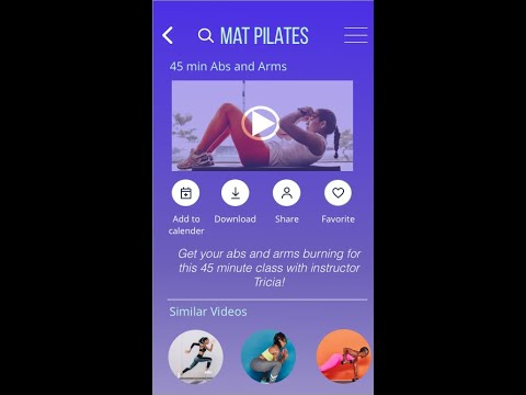
NOTE: THIS IS MY EARLIEST PROTOTYPE DESIGN
QuickFit is a fitness app that allows you customize your fitness routine with providing routine guides, interactive examples, and info. We want to encourage people to get into an easy routine based off your goals and schedule with classes ranging from 15 min - 1 hour.
Role: UX/UI Designer
Tools: Adobe XD, Sketch, Invision
Timeline: August 2020-October 2020
Who?
● People who are new or returning to fitness that want to find activities they like, and get into a good routine.
What?
● A responsive web app is best for QuickFit, as users can search and view routines, guides, daily challenges, and other information on any device. They can also keep a schedule by adding sessions to their personal calendar.
When?
● As the web app aims to get users into a routine that suits them, the web app can be used whenever they like. They will use the web app while they are searching for, scheduling, and following routines.
Where?
● As the web app aims to get users into a routine that suits them, the web app can be used whenever they like. They will use the web app while they are searching for, scheduling, and following routines.
Why
● To become healthy and enjoy the associated benefits (better mood, weight management, reduce risks of illness, learning something new)
User Personas
The user persona was created to resemble a person who can fit in a quick workout in their schedule during the day. We therefore created Rebecca who represented a middle aged mother who can’t find the time to exercise but wants to get into a routine.
Rebecca Minkoff, 34
Goals
Rebecca wants to lose weight and get in shape, as her sedentary job doesn’t allow a time for exercising. To help with this goal, she wants to find a tool that will help her find a good exercise routine into her busy schedule. She also wants to be able to find exercises that match her goals of losing weight and getting in shape. The typical exercises she likes is short exercises she can do multiple times per day between activities.
Environment
Rebecca lives in an apartment with her boyfriend and 3 year old daughter. She is a medium tech savvy person and has a couple friends from work.
SiteMap
After completing a competitive analysis of 3 different apps: FitOn, Openfit, and Seven I realized what I liked and didn’t like in an app and created a sitemap. The purple is how I would like the main part of the app to be navigated, with the yellow representing the side screens that a user may or may not have to go through. When creating the sitemap the goal in mind was simplicity.
Sketches Low-Fidelity
I used the crazy 8 technique to develop what I would like based off of each screen. I liked the idea of having an on boarding process that way after completing the questions the user had a layout of videos that would interest them (this I thought was a good way to keep the user engaged).
Login Process
UI Element Organization
Before: I had the shapes stacked and no lines through to separate
After: The main parts are side by side, eventually I will have it all one color at the top and a separate color at the bottom, it will probably be separated by a light grey line
UI Design Mid-Fidelity Patterns
On-boarding Questions
I changed the on-boarding questions to a bar at the top with the option to press back if necessary
Logging In and Creating Account
For the log in the username is moved to the top and presses green when you are on it. I also changed the “forgot username?” to “I forgot” For the create account I made sure to include a red area if the password doesn’t meet certain criteria.
Explore Page and Filter
I changed the Explore Page to a more organized Page where it can be filtered by the kind of exercise at the top with the option to press filter for more options to filter it
Friends section
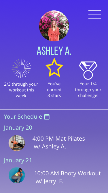
For the friends I added a likes and fist bump area as well as an option to join the challenge. I also added a separate page of how I would like the search for the friends to look like.
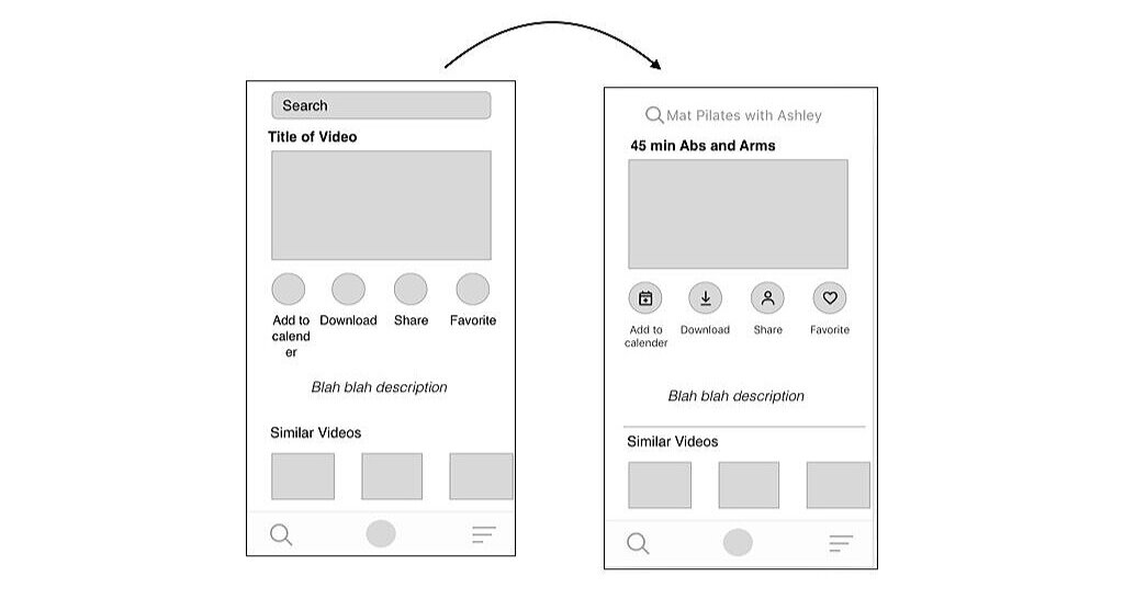
Video Page
This is how I would like the video page to look like with the option to still have a search bar at the top
MoodBoard
QuickFit Color Scheme
Here I decided to do purple as my background. With a light blue as the head of the page and then a darker bluish purple as the “submit” button. I believe this catches the users eyes and attention with purple known to be more of a calming color and blue as an energetic one.
Style Guide
QuickFit Final Screens
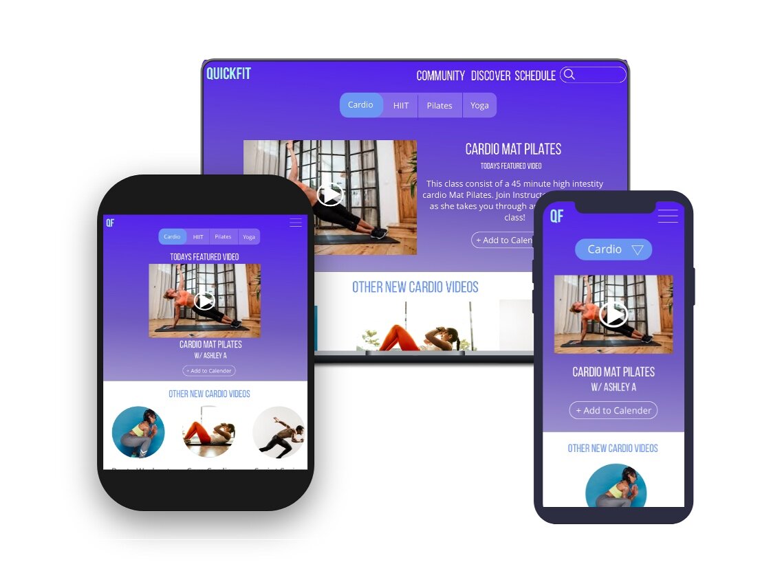
QuickFit in tablet, desktop, and mobile form
Video Walkthrough of QuickFit


