Snow Drift
Pre-plan your travel to the mountains
**Note: this is one of my super early app design projects!
SnowDrift is a weather app designed to give past, current, and future forecast. The app alerts users for powder alerts, bluebird days, and gives up to date ski traffic information. SnowDrift will answer our problem statement for people who participate in winter sport activities needing to see future forecast so they can safely attend their activity for that time of day.
Problem Statement
People who participate in winter sport activities need a way to see future forecast so they know if they can safely attend their activity for that time of day
We will know this to be true when we see users use our app and can navigate it swiftly and easily to access their favorite trails or mountains to see their future forecast for that day
Possible Problems
Weather is sometimes unpredictable, meaning it could change on the spot so a storm could come earlier or later (forecast not up to date or completely false forecast), having too much information displayed rather than simplified could also cause confusion, and not having enough data for not as populated areas.
Possible Solution
By creating SnowDrift, a user will be able to not only see the future forecast but also be able to access mountain webcams, reviews of trails, and notifications for powder alerts or hazards, this will help someone plan out their winter activity for that day and best time to go at.
Competitive Analysis
I decided to conduct a competitive analysis of FreshSnow and OpenSnow to help identify underserved opportunities in the market that my app could provide. It also allowed me to develop a marketing strategy to make my product stand out against competitor offerings.
Fresh Snow
Here I used a SWOT Analysis to break down my findings from Fresh Snow. I also made note of the positives and negatives of FreshSnow along with screenshots so I know what to and not to include in SnowDrifts app.
OpenSnow
I did a deep dive into OpenSnow with a UX Analysis.
Navigation Structure: Overall, easy to navigate. If you wanted to add a mountain to your favorites so it appears on your homepage you just have to search for it and click the star at the top. The one critique is I probably would have the star closer to the center of the page and not so hidden. Other than that super easy to look a mountain up.
Compatibility: OpenSnow works for androids, apple, and as well has it’s own website, so it works well across all platforms. On it’s website it is similar to the app, but just requires a login so you can see your favorites. Easy navigation across both ends.
Differentiation: What I liked about OpenSnow is the questions and personalization of the app from the beginning. What I would like to change is so that it is not as cluttered on the home screen and to combine both the explore and search engine since they seem to be the same. The explore does seem unnecessary. I do think the news category is good for people who want to use this app for longer than 5 minutes, but it is not a good 2-3 minute quick check app to see what mountain you would like to go to in the morning.
Calls to Action: Users have to purchase to see a 10 day forecast as well as certain webcams and broadcasters. Most of it is free besides those forecast days, which you can swing around without paying the $20 fee.
User Research
I conducted a survey with 21 participants and asked a series of questions that would help us see the importance of the app and what features people would want to see. This helped get a better understanding of the “needs and wants” for SnowDrift. How I recruited participants was through email, facebook, and twitter.
User Interviews
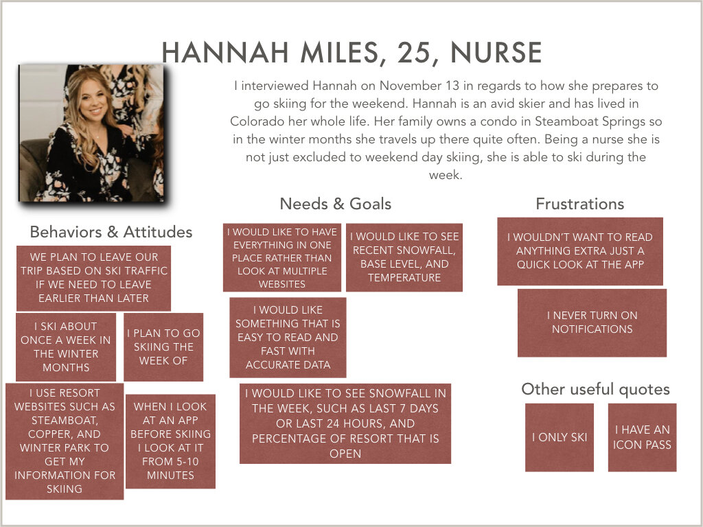
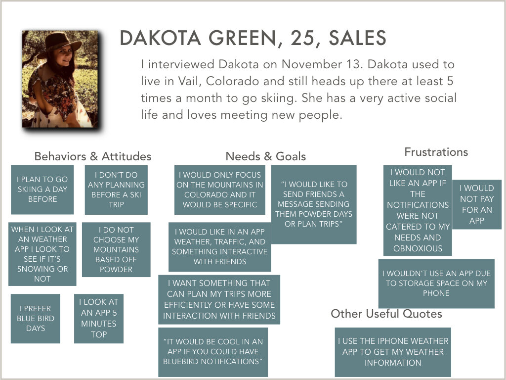
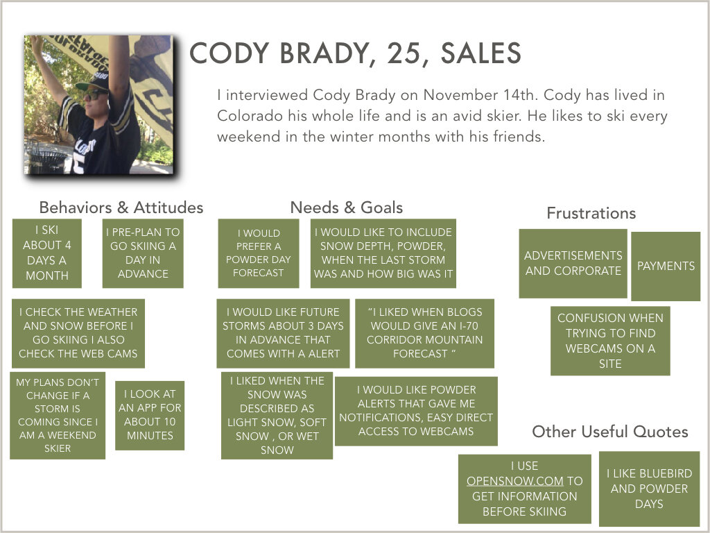
I interviewed 5 different people and asked them a series of questions in regards to how they prepare and look forward to their winter sports activity. The questions are very general questions so that I do not persuade them to choose a side, but also give me a general idea of the needs and wants in an app. I broke down what they said into 4 separate categories: behaviors and attitudes, needs and goals, frustrations and other useful quotes. In the end I grouped the results into affinity maps based off their quotes such as notifications, mountain information, ski traffic features, and weather features.
User Personas
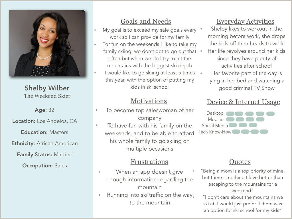
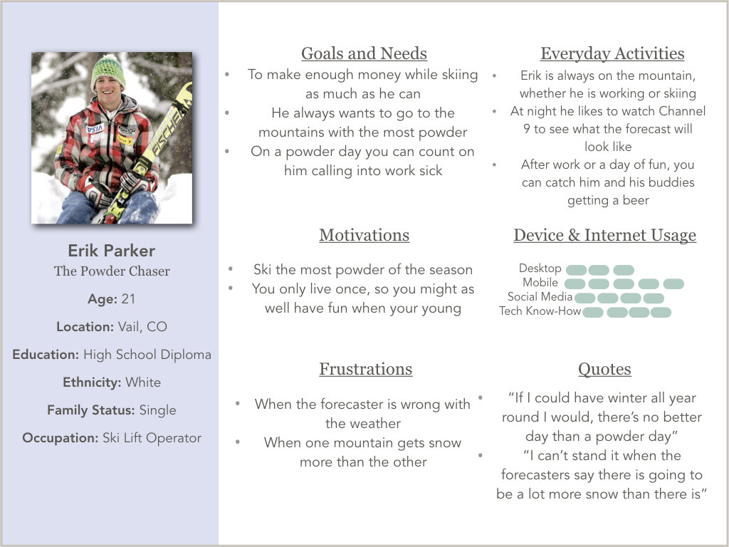
These user personas were created based off my user research. Here I created 3 User Personas. Shelby Wiber who is known as a weekend skier, Erik Parker who is the typical ski bum, and Richard Barale a retired skier traveling the world. Based off their goals and needs is how I will determine what direction I would like to take my app.
User Journeys
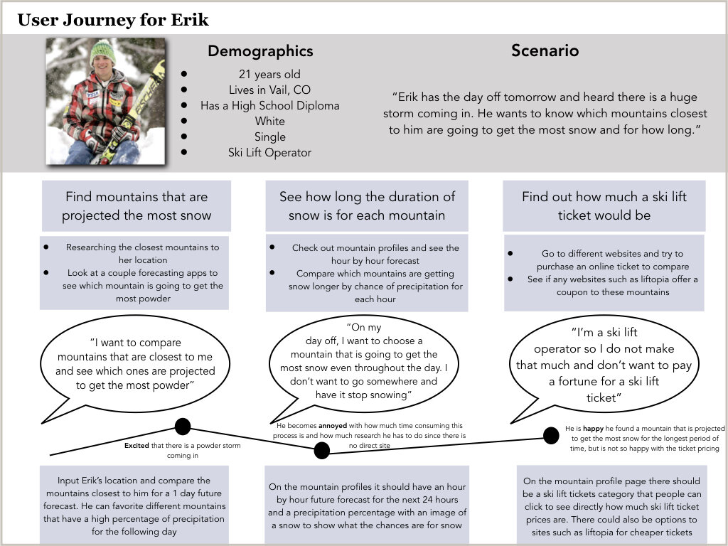
Based off the user personas I was able to create user journeys which includes goals and needs, motivations, frustrations, technology use, and everyday activities. These personas represent my targeted audience. By separating the user journey into phases, tasks, thoughts, and emotions I am able to empathize with the user persona and think of them as a real person. All 3 of them had a great impact on how the app was built and the applications that were needed in the app to provide the needs and wants to a client.
User Flows
These user diagrams are based off the flow from user journey. With the needs and wants I created a user journey (shown above) and picked one of their phrases that I felt was most important with the app. For Erik’s user flow I chose his phase for the most snow in 24 hours since I believe that would be a very popular phase for people to use an app for. For Shelby’s user flow I focused on more of a ski traffic option since she is a weekend skier and wants to see how far or close each mountain is from her. For Richards user flow I went with the focus on Mountain Interactive Maps (I still went through and put a review tab on the mountain profile based off of his user journey), however regarding the flow I felt the Mountain Interactive Map was super important since based off my competitive analysis there was no mountain map option, instead you had to visit each individual mountains site. Luckily, SnowDrift can take that problem out of the equation and make it an all in one stop.
Eriks User Flow
Shelbys User Flow
Richards User Flow
Card Sorting
The aim of this card sorting is to see what categories my participants would choose certain tasks to be in. Using my SnowDrift app concept, I chose to do a closed card sorting with the categories of Ski Traffic Page, Profile Page, Mountain Profile, Favorites Page, and Explore Page. I conducted the card sorting with 8 participants and 27 cards.
Card Sorting Results
The results from my card sorting turned up to mostly be what I expected. The 38% parts did make me rethink my card sorts in which resulting in me changing my sitemap. What surprised me the most was the “add social media” on the profile page because I was originally going to set it on the mountain profile page. Where there were high percentages just confirmed my decision to put things were they were at, versus where there was low percentages I had to decide if that was the best placement for it.
Sitemap
After user interviews and card sorting I created a “finalized” draft of my sitemap and how I would like it to look like. The Sitemap gave me a general guideline on what I wanted on my tab bar, and how I wanted to organize information in certain categories.
Sketches
These are my first sketches to the app and my invision on how I wanted it to look like. I first started off with a 1 minute draw and then did about 10 sketches and chose from the screens out of the 10 which one I believe would be a perfect fit on my app. I also use the crazy 8 technique to draw what screens I would like and chose to dot the certain ones I felt would fit into the app.
On-boarding Process
Explore Page
Mountain Profile Website
Low Fidelity Prototype
Adobe XD was used to create prototype
On-boarding Process
Interactive Mountain Map
Explore Mountains Closest To You
Ski Traffic
Usability Test
Affinity Map
I recruited 6 participants who had to complete 3 tasks using the low fidelity prototype so I could figure out what needed to be fixed on the app. The first task was to plan a trip to Denver, CO and figure out the best day and time to go. The second task is that a winter storm is coming and you want to find the mountains closest to you with the most powder, use SnowDrift to find the mountain(s) you would like to go. The third task is to find Copper Mountains terrain and decide what ski runs you would like to go on. The Affinity Map allowed me to isolate information from the usability test and helped me determine how it relates to the other bit of information. I realized the errors I needed to correct which gave me some clarity on some improvements I can use. One example is that my ski traffic page had major errors in it because no one knew what the icons or words meant.
Rainbow Spreadsheet
The Rainbow Spreadsheet helped me group the information from the usability test interviews and create a visualized pattern. This also helped me classify my errors from important ones to not as important which helped me save time as well. Based off the rainbow spreadsheet the main problems that had 6’s were the use of symbols such as the ski traffic and map symbol, also making information more spaced so it doesn’t look more cluttered.
Changes from the Usability Test
Ski Traffic
The ski traffic changed in ways that was just more cleaner and fresher and questions were asked at the bottom of the prototype rather than the top. I also came up with a symbol instead fo the word “graph” so that way people would be more inclined to click on it to see the past 7 days. A “Go” button was added to as well as different colors with the graph
Mountains Closest To Me Result Page
With here I learned to make the spacing larger, icons bigger, but also make sure the mountain with the most snow was highlighted at the top so that way people could differentiate from the other mountains while also adding a red color to “24” predicted” and the option to sign up for an alert.
Explore Page
The main change here was space in between rows so that way people could see it more clearer as well as the icons growing bigger as well. The button also changed to a hovering button located at the bottom of the page rather than obstructing with space on top.
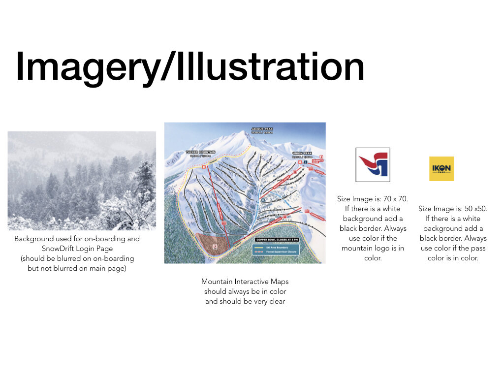
Style Guide
Final Design
Here we have the “before and afters” of my screens. I start with the sketches and end with the final products. Scroll below to see the answer to all the user journeys!
Final Onboarding Process
“Mountains Closest to you”
This answers the user journey of Erik who wanted to see what mountains closest to him with the most snow. When you get to the final page after answering a few questions, it filters by the mountains with the most snow and the mountain with the most predicted snow is highlighted in grey at the top of the screen.
“Mountain Profile Page”
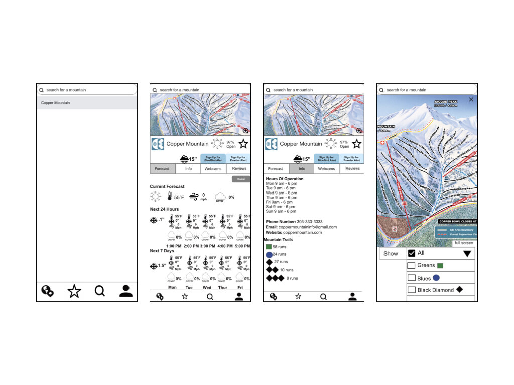
This answers the user journey of Richard who wanted to explore a mountains terrain before actually heading to the mountain. We start initially at the explore page and then click the search bar on top that brings us to the Copper Mountain Profile Page. Thus if you click the mountain image at the top of the profile it will let you explore what runs the mountain has to offer and you can even select if you only want to see black diamonds, blue runs, etc.
Ski Traffic
Here we answer the user journey of Shelby who pre-plans her weekends up to the mountains. By using the time graph button she is able to see the past 7 days of high and low traffic times from her location to the location she would like to go to. Based off the highs and low times she is able to see what time she needs to leave by in order to avoid traffic.
Conclusion
Skills: User Testing, Interview Questions
Skill Gaps: Adobe XD, Animations
Processes: User Centered Design
Solution: Review Adobe XD and many youtube videos
What did go well
I find it was very easy to find people to interview and do user testing. I also loved doing a comparative analysis test at the beginning so I knew what I wanted and didn’t want in a prototype. Also by having a lot of user testers and interviewers I was able to redesign my product pretty quickly and make it more user centered.
Challenges Overcome:
The challenges I faced for SnowDrift had to deal a lot with technology. Being a Pilates Instructor I haven’t had to be around to technology a whole lot, and getting an apple computer again I wasn’t used to the programs. Starting with Adobe XD it took me a very very long time to learn it and the correct forms of how to use it. I overcame these by many hours of tutorials and through trial and error from low fidelity to mid fidelity and finally high fidelity. I didn’t have a problem with sketching things out or how I envisioned how I would like my prototype. A problem was getting organized and managing my time wisely and learning how to put all my ideas at once on to a prototype.
Enjoy!
Here is a video of my app that will take you through all aspects of the app as if you you actually had the app downloaded on the phone yourself!


